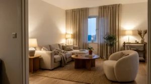
Saving inspiration is easy and slightly addictive. You end up with a folder of gorgeous apartments, all of them with huge windows, none of them with the beige vertical blinds and one sad ceiling fixture that your actual place came with.
That gap is the frustrating part.
So this is the version I put together after moving into three different student apartments, sorted by look rather than by room, with a note on each about what it actually costs and what breaks when you try it.
What makes those photos look the way they do
Almost every apartment photo you have saved shares three things, and none of them are furniture. Warm layered lighting instead of an overhead. A limited color palette, usually two colors and a neutral. And texture, meaning linen, wood, woven baskets, something with a bit of roughness to it.
That is genuinely most of it. I noticed the day I copied the lighting from a photo I loved, rather than trying to copy the furniture, my apartment jumped about eighty percent of the way toward looking like the picture. The couch was still the ugly one that came with the place. Nobody could tell in photos.
1. Warm neutral with wood and cream
The most copied look right now and the easiest on a budget. Cream bedding, oatmeal throws, a jute rug, unpainted wood, warm bulbs everywhere. It works because thrift stores are full of wooden furniture and none of it needs to match, as long as the tones sit within a couple of shades of each other.
2. Layered maximalism with a limited palette
Lots of stuff, but all in the same three colors. Posters, plants, textiles, books, all layered dense but held together by a repeated color. The mistake here is layering without a palette, which is just clutter, so pick two colors before you start pinning anything to a wall.
3. Soft grunge and dark academia
Deep colors, moody lamp light, secondhand books, brass and dark wood. This one photographs beautifully and is genuinely cheap to build because charity shops are full of exactly these objects. Keep one lamp warm and low rather than lighting the room evenly, since the mood depends entirely on shadow.
4. Minimal with one strong color
Neutral base, then a single saturated color repeated three or four times. One red chair, a red throw, a red poster. It looks deliberate and expensive and it hides the fact that you own very little, which as a student is usually the actual situation.
5. Plant heavy corner
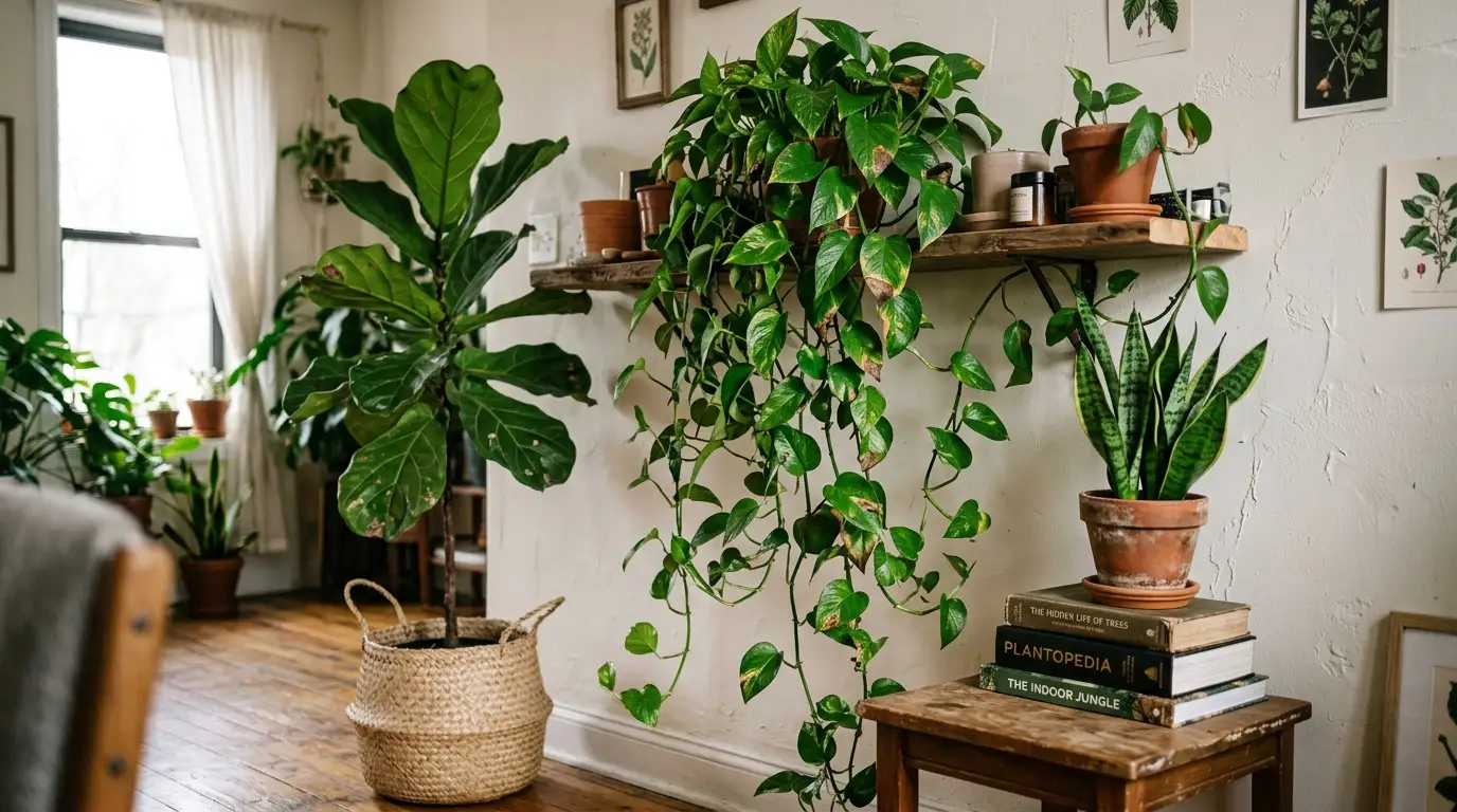
Not plants everywhere. One dense corner with three or four plants at different heights, one tall in a basket, one trailing from a shelf, one small on a stack of books. Pothos and snake plants survive student lighting and student schedules, and a fiddle leaf fig will not.
6. The good lamp setup
This is the one that matters most and the one people skip. Three light sources minimum, all warm around 2700K, and the overhead switched off. A floor lamp in a corner, a table lamp by the sofa, something small on a shelf. It costs about forty dollars secondhand and it is the difference between your apartment and the photo.
7. Gallery wall done with real frames
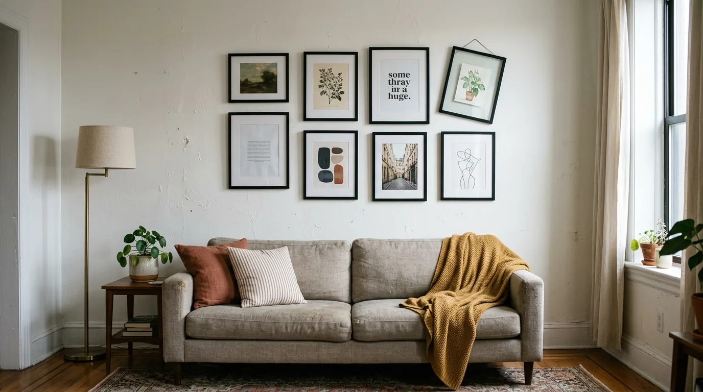
Thin frames in one finish, mixed contents, hung with heavy duty adhesive strips. Posters taped flat read as a first year dorm, framed prints read as an apartment. Charity shops sell frames constantly, and you can put anything inside them, including things you printed for a dollar.
8. Kitchen shelf styling that survives cooking
Open shelf styling looks great and collects grease if it is near the stove. Do it on the wall by the sink or the coffee corner instead, keep only what you use weekly, and pick two materials, usually wood and ceramic. Everything else lives behind a cabinet door.
9. A curtained or defined bedroom corner
If you are in a studio, or sharing a room, a curtain on a tension rod or a bookshelf turned perpendicular creates a real separation. It reads as intentional design in photos and it genuinely improves how the space feels to live in. Check your lease before mounting anything.
10. The secondhand mix that looks collected
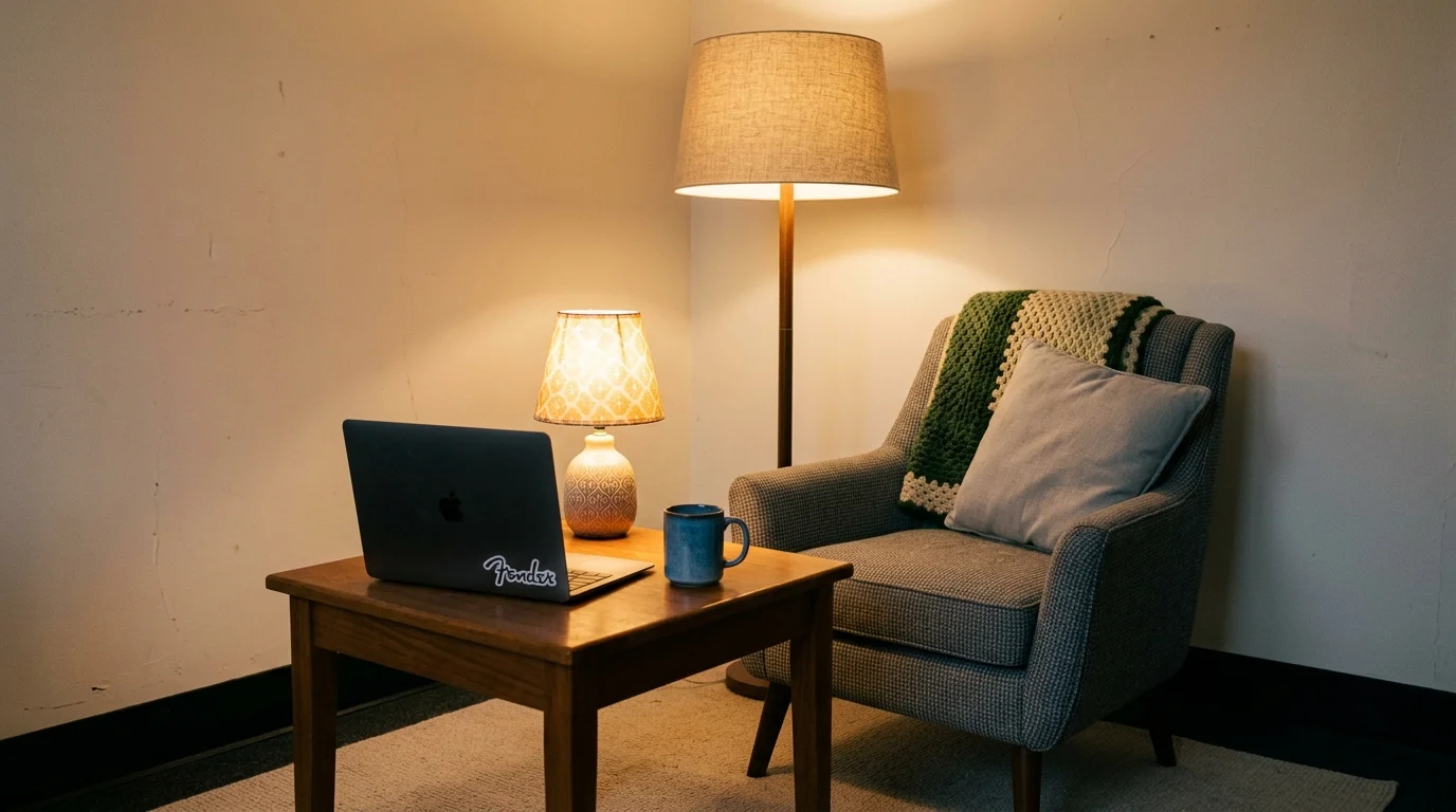
Older wooden furniture, one newer soft piece, and something clearly vintage like a brass lamp or a worn rug. This combination is what makes a room look like it accumulated rather than arrived, which is exactly what the expensive apartment photos are imitating. Estate sales beat thrift stores for this.
11. Warm hidden LED, not visible strips
An LED strip behind a headboard or under a shelf, set to warm white, with the diodes hidden from view. You see the glow, never the dots. This is the single biggest difference between a setup that looks styled and one that looks like a gaming corner from a few years ago.
12. Skip the trend that will not survive the year
Some of the most saved looks are genuinely impractical in a rental. Anything requiring paint you cannot remove, heavy shelving into plaster walls, or a rug so light that one spilled coffee ends it. Save the ideas, but check each one against your lease and your actual life before you buy.
How to turn a saved folder into a real apartment
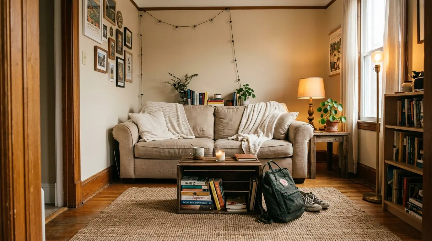
Go through your saved images and write down what repeats rather than what you like. Are they all warm toned? All plant heavy? All dark and moody? Three or four images is enough to spot your pattern, and that pattern is your palette. Then spend in this order, because it is the order that changes the most per dollar. Lighting first, since it is cheap and transformational. Then one large soft thing, usually a rug or bedding, which sets the color. Then furniture, bought secondhand, since student marketplace listings in late May and late August are full of people who just want their stuff gone. Then small styling objects last, once you have lived there a month and know where you actually put things down. On money, most of the looks above are achievable for under two hundred dollars if you are patient and buy used, and the single most expensive mistake is buying a whole matching set in one order, which never looks like the photos anyway because the photos are all mismatched. And a practical note on all of it, photograph your apartment on move in day including every mark and stain, and keep every wall fix removable. Nothing ruins a good setup like losing your deposit over adhesive strips you pulled off too fast.
Frequently asked questions
How do I make my college apartment look expensive on a budget? Fix the lighting first with two or three warm lamps and stop using the overhead. Then add one large neutral rug and buy your furniture secondhand, since mismatched older wood reads as collected rather than cheap.
What is the most popular college apartment aesthetic right now? Warm neutral with natural wood and cream textiles remains the most copied, with dark academia and layered maximalism close behind. All three are achievable secondhand, which is part of why they spread.
How do I decorate a rental apartment without losing my deposit? Use quality adhesive strips rated well above the item weight, lean art instead of hanging it, and test removable wallpaper on a hidden patch first. Photograph all existing damage on move in day and email it to your landlord.
How much does it cost to decorate a college apartment? Most students can put together a genuinely good looking space for one hundred fifty to three hundred dollars, split with roommates for shared areas. Buying used for anything large is what keeps that number down.
What should I buy first for a college apartment? Lamps with warm bulbs, then a large rug, then furniture. Small decor items should come last, after you have lived there long enough to know how the space actually gets used.
Final thoughts
The apartments that look best in photos are usually the ones where somebody made four or five good decisions and then stopped. Warm light, a tight palette, a bit of texture, and a couple of things with some age on them.
So pick one look from this list and copy the lighting before anything else. If you do that and take a photo, come back and tell me whether it made the difference, because I still think it is the most underrated fifty dollars a student can spend.